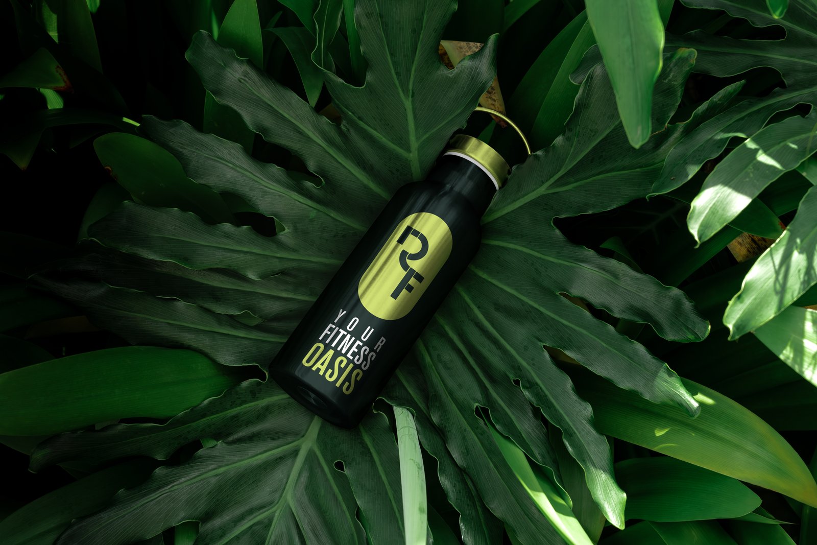
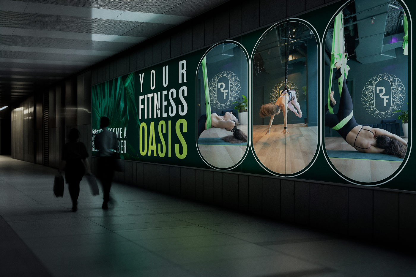
RF Studios is a luxury fitness oasis in the heart of South Beach — aerial yoga, bungee classes, TRX, red light therapy, sauna, and a live plant wall that sets the tone the moment you walk in. The brief wasn't just to design a logo. It was to build a world.
After years of collaborating on their original concierge brand, they came back to MIUX to craft their boldest venture yet. The direction: blend serenity and boldness, rooted in movement, renewal, and joy. Light, luxe, and grounded — all at once.
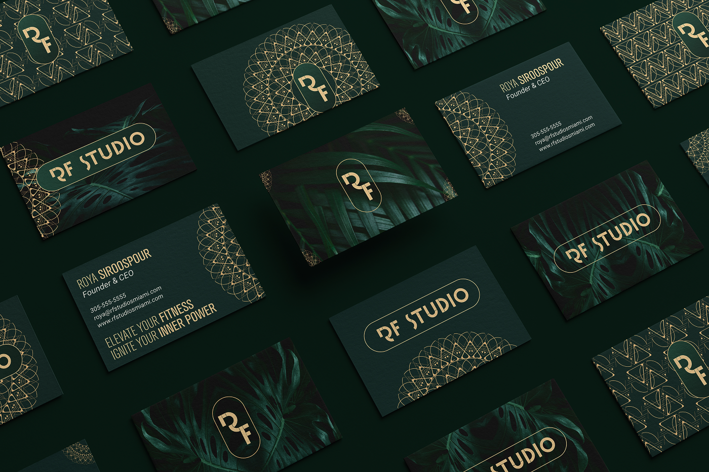
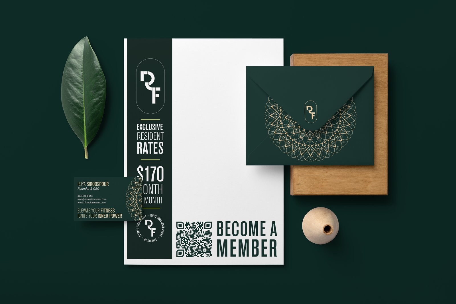
The logo came from that tension. The air sign is embedded within the R and F letterforms — a nod to the aerial classes that define the studio experience. The mandala draws from the interior's organic elements and live plant wall, incorporating symbols of both air and earth. Greens and gold, Art Deco elegance, Miami Beach through and through.
Two logo concepts were presented — one leaning into abstract modernism, the other into Art Deco ornament — giving the client a real choice between two fully realized directions rather than variations on one idea.
From there the system expanded: web and mobile UI, custom photography and video direction, print collateral, and color-coded aerial hammocks (yes, really). Every touchpoint considered. Every detail intentional.
This case study covers the final brand system. But if you want to see the other flight path — the concept that didn't launch — that's the previous post.